


Syncfusion Xamarin UI Controls
 Trusted
 5.1+
5.1+
 PEGI-3
Description of Syncfusion Xamarin UI Controls
Syncfusion Xamarin UI Controls is a development application designed for the creation of user interfaces in mobile applications using Xamarin technology. This app serves as a sample browser that allows developers to explore the various components and functionalities included in the Syncfusion Essential Studio for Xamarin. Developers can download Syncfusion Xamarin UI Controls for the Android platform to gain insights into how to effectively implement these components in their own applications.
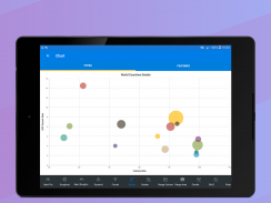
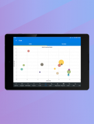
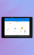
The application provides a rich array of UI controls specifically tailored for Xamarin.Android and Xamarin.Forms. With over 25 chart types available, developers can visualize data through line charts, pie charts, and specialized financial charts. This variety supports diverse data representation needs, making it easier for users to interpret complex information visually.
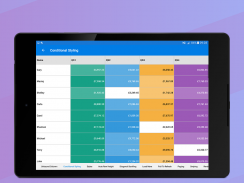
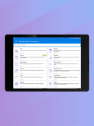
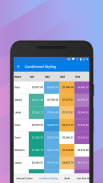
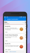
The DataGrid component is another integral part of this app. It offers a full-featured grid control, enabling functionalities such as grouping, sorting, filtering, and exporting data to Excel. This control is essential for applications that require the management of tabular data, allowing developers to present information in an organized manner.
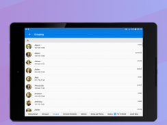
A distinctive feature of Syncfusion Xamarin UI Controls is its advanced ListView component. This control supports grid layouts, grouping, pull-to-refresh, and filtering capabilities. It allows developers to create a dynamic and responsive user experience, catering to various data presentation styles.
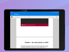
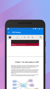
The PDF Viewer component enhances the app's functionality by providing high-performance capabilities for viewing PDF documents. Users can benefit from features such as search, zooming, and text selection, which are critical for applications that involve document handling and reading.
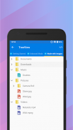
For applications requiring hierarchical data presentation, the TreeView control is a valuable asset. It displays data in a structured format with expanding and collapsing nodes, making it easy to navigate complex datasets.
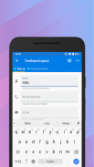
Text input is managed effectively through the TextInputLayout control, which adds decorative elements like floating labels and icons to input fields. This control improves the user experience by providing clear context for data entry, ensuring that users understand what information is required.
The Autocomplete component enhances user input by offering suggestions based on previously typed content. This feature streamlines the data entry process, making it faster and more efficient for users to complete forms and other input tasks.
In terms of data validation, the NumericTextBox serves as an advanced version of the traditional text box. It restricts input to numeric values, ensuring that users can only enter valid data, which is essential for applications that require specific data types.
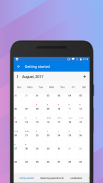
The Calendar control provides a month-view interface that displays events and allows for date selection. This functionality is crucial for applications that involve scheduling or event management, providing users with a clear visual representation of their appointments.
Navigation within applications is facilitated by the NavigationDrawer control, which offers a sliding panel to hide menus and other content from the main view. This design choice helps maintain a clean and organized user interface while still providing access to important navigation options.
The Gauges component allows for the visualization of numeric data through several formats, including circular, linear, and digital gauges. This feature is particularly useful for applications that monitor metrics or performance indicators, providing users with immediate visual feedback.
The Range Navigator control simplifies the process of selecting a smaller range from a larger dataset. This is particularly useful in applications that deal with extensive data collections, allowing users to focus on specific segments of interest.
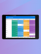
The Scheduler component provides a robust calendar interface for managing appointments and events. It includes features that assist users in organizing their schedules effectively, making it a vital tool for time management applications.
For indicating busy status within applications, the BusyIndicator offers pre-built animations. This feature informs users that a task is in progress, enhancing the overall user experience by providing visual feedback during loading or processing times.
DataSource simplifies the connection to various data sources, facilitating operations such as sorting and filtering. This component is essential for applications that rely on data integration, helping developers manage and manipulate data efficiently.
The Backdrop control serves as a background element that displays contextual content, enhancing the aesthetic of applications while providing additional information. This visual aspect can be particularly engaging for users, as it combines functionality with design.
The Border control allows developers to draw a border and background around other objects, contributing to the visual organization of user interfaces. This control can help in creating distinct sections within the app, aiding in navigation and user understanding.
The Button control enables users to perform actions through clicks, and it supports displaying both text and images. This versatility ensures that buttons can be tailored to fit the design and functional needs of various applications.
The BadgeView is a notification control that displays small shapes containing numbers or messages, effectively conveying important information to users. This component is useful for indicating notification counts or statuses, keeping users informed without overwhelming them.
The Chips control presents data in a concise manner with images and text, while the Chip group control arranges multiple chips in a layout. This feature allows for the effective presentation of related information, enhancing user interaction.
The ParallaxView creates a dynamic visual effect by binding the scroll position of foreground and background elements. This adds depth to the user interface, making the experience more engaging and visually appealing.
With these diverse components, Syncfusion Xamarin UI Controls provides developers with essential tools for creating functional and visually appealing applications on the Android platform. For more information, visit https://www.syncfusion.com/products/xamarin.
Syncfusion Xamarin UI Controls - Version 23.1
(30-09-2023)
Syncfusion Xamarin UI Controls - APK Information
APK Version: 23.1Package: com.syncfusion.samplebrowserLatest Version of Syncfusion Xamarin UI Controls
Other versions


Apps in the same category


